Which Fonts Use The Least Ink & Toner? [We Tested 7 Different Fonts]
Posted by Rob Errera on 06/16/2023

Fonts Test by Toner Buzz
✔ We tested 7 of the most popular economical fonts. Choosing the right font can save you as much as 77% on your printing costs!
Here at Toner Buzz we decided to put these “eco fonts” to the test.
Determined to find the best fonts for print, we dove deep into which fonts to use.
We took seven of the most popular low-consumption print fonts and ran pages until our ink ran out.
To be sure that our results were objective, we used only black ink and printed just black and white text.

What did we learn from our test fonts?
Surprisingly, several modern, environmental fonts used the most ink, while old classics flexed their storied reputations. Score a win for the senior citizens of the typeface world!
Find out more about our printing fonts test in this video:
How We Chose These Seven Fonts
We scoured the internet, poured through old design magazines, and waded through dusty typeface tomes to narrow down our field of economical fonts to these seven.
Fonts used included traditional printing fonts as well as fonts with holes and other eco-friendly fonts designed to save ink.
Printing Fonts We Tested:
- Calibri
- Century Gothic
- Ecofont Vera
- Times New Roman
- Ryman Eco
- Garamond
- Courier New
Again and again, these seven fonts turned up on lists of low-ink consumers.
Are these the most economical fonts out there?
Well, they’re certainly the ones that get the most press.
But can you believe the hype? Are these fonts truly low ink consumers? Which one is best font for print? Which font uses the least ink and paper?
Check out the results below.
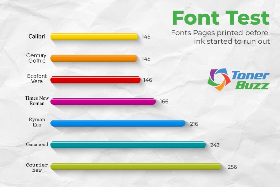
Print Test Results
| Fonts | Pages printed before ink started to run out |
| Calibri | 145 |
| Century Gothic | 145 |
| Ecofont Vera | 146 |
| Times New Roman | 166 |
| Ryman Eco | 216 |
| Garamond | 243 |
| Courier New | 256 |
Print Test Analysis

Calibri
Calibri, what happened to you? You failed! Badly!
Calibri has long been celebrated as a good font when looking to save ink and toner. But our in-house tests showed otherwise.
Calibri debuted with the release of Microsoft Office 2007 and Windows Vista, and it remains a popular, easy-to-read font, especially on screen.
However, if you’re printing out page-after-page, you’ll find Calibri sucks a lot of ink and toner.
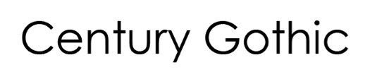
Century Gothic
Like Calibri, Century Gothic also let us down in our ink consumption tests.
Century Gothic has been around since 1991, and is a clean, sans serif font that makes reading a pleasure. It has also earned a reputation as a low-consumption font.
However, our tests showed that if you print long reports in Century Gothic you’ll waste a lot of ink or toner.
Century Gothic tied with Calibri as the worst performing font in our ink consumption test. Boo!
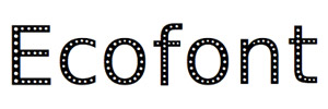
Ecofont
Shame on you, Ecofont! You call yourself a money-saving font?
You only eeked out one more printed page than those losers, Calibri and Century Gothic!

While the idea of poking holes in traditional fonts like Times and Verdana may seem like a logical way to save on ink consumption, our tests with Ecofont San Vera were disappointing.
While Ecofont software claims to reduce ink and toner consumption by as much as 50% we saw no such savings, only a strange font looks blasted with shotgun pellets at larger point sizes.

Times New Roman
Sometimes old school is the best school. Times New Roman has been a newsprint staple since 1931, continues to hold its place among the top professional fonts, according to our research.
This elegant, thin-lettered font was designed for economical ink consumption and it performed admirably in our tests, besting more modern, ink-savvy typefaces (we’re looking at you Ecofont Sans Vera!).

An oldie but a goodie, Times New Roman isn’t the most economical font, but it’s far from the worst.
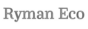
Ryman Eco
Now we’re talking serious ink savings!
Developed by UK office supply giant, Ryman Stationery, Ryman Eco’s letters are made of thin lines.
This is the same “hollow letter” concept behind Ecofont, only Ryman Eco seems to actually work.
You don’t notice the hollow letters at smaller point sizes, and even blown up, Ryman Eco remains easy on the eyes.
If you believe its creators, Ryman Eco could save us 490 million ink cartridges and 15 million barrels of oil if used worldwide.
We know Ryman Eco produced 71 more pages than Calibri and Century Gothic, a 49% performance increase! Believe that!
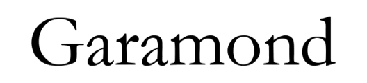
Garamond
Old school strikes again!
Garamond is an elegant serif typeface developed by French publisher and type designer Claude Garamond in the 16th century, back when fonts were cut into the faces of metal punches and stamped onto parchment, or cut into wood.

The secret to Garamond’s low ink consumption lies in its small, tight letters. Garamond looks a bit smaller than other fonts of the same size, but its clarity still makes it an easy read.
Garamond is one of the go-to print out fonts if you need a font that uses less ink... and we all want fonts that save ink!
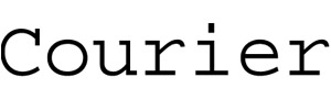
Courier
Ah, Courier, the classic “typewriter font,” how we love you!
Your big, round, airy letters may look dated, but they’re easy to read and sips ink like its Dom Perrigon making you one of the best fonts for printing.
In our tests, Courier produced 111 more pages than Calibri and Century Gothic, a massive 77% increase in output!
Economical, easy to read, and retro-cool — what’s not to love about Courier, a fine font that uses less ink?
Nothing, that’s what!
If you’re into computer coding or screenwriting, the Courier typeface is an old friend. If you need to print a long document, save yourself some ink or toner - use Courier!
The Right Font For You
What font to use?
The goal here is finding the right font for you. You need a font which uses the least ink that strikes a balance between readability and reasonable ink consumption.
Finding what font to use may take some trial and error. Demand sustainable fonts, people! Economic fonts!
Which font uses the least amount of ink?
In our tests, Courier was the font that uses the least ink. Your mileage, and page count, may vary when determining which font to use.
Classic fonts to save ink like Times, Courier, and Garamond are good fonts for print. But we also like the direction Ryman Eco is taking modern, ink saving fonts.
In general, a big, bold, flashy font will consume a lot of ink and are not the cheapest font to print. But, surprisingly, even simple fonts, like Arial, are hogs when it comes to ink and toner consumption.
The best printing fonts are ink saving fonts. Stick with the classics and save yourself some money!
Beyond Just Fonts: More Ways To Save Ink & Toner
While font choice plays a major role in ink consumption, other factors—like the type of cartridge and paper you use—can also impact printing costs.
Using original ink and toner cartridges helps avoid printing issues and extra costs. Non-original cartridges may seem cheaper but often lead to poor print quality, higher toner use, and printer damage. Original cartridges provide consistent results, reduce waste, and prevent reprints, saving money long-term.
While original cartridges may cost more upfront, you can still make smart choices to save money. If you print rarely, you can consider standard cartridges like F6T80AN (HP 972A), J3M71A (HP 981A), W2020A (HP 414A), or W2110A (HP 206A).
For those who print frequently, high-yield cartridges are a better choice, as they last longer and lower the cost per page. Another way to save is to purchase cartridge sets. You can find sets in both standard and high-yield versions, such as HP 414A 4-Pack, HP 414X 4-Pack, HP 206X 4-Pack, or HP 972X — which can help you save more compared to buying them separately.
Beyond cartridges, paper choice also impacts overall printing costs. Using lighter-weight or recycled paper can help cut expenses, while high-quality paper may be necessary for professional or archival prints.
Choosing the right font, cartridges, and paper can help you reduce printing costs while keeping your prints clear and reliable.

Rob Errera
Rob Errera is an award-winning journalist embedded in the world of printers and printing supplies. Rob has nearly two decades of experience writing about cutting edge technology, business trends, and the ever-evolving industry of printing.